
Precision You Can See in the Letters.
FLG cuts dies and laser-cuts material for industrial clients, a business where precision is the entire value proposition, and the brand was quietly undercutting it.
FLG is a die-making and laser-cutting manufacturer serving industrial clients in Brazil, where tolerance is measured in fractions of a millimeter. The work was precise; the brand looked like a generic workshop, and it was costing them credibility in quotes against larger competitors. FrixB built a complete identity system and the bilingual guide that lets vendors execute it unsupervised.
3-tier
Primary, secondary and tertiary logo lockups
2 Colors
A whole brand on red and black, zero gradients
TBD
Business outcome — add once confirmed with the client

Precise work that looked like a generic workshop.
In industrial manufacturing, the brand is often the only evidence a buyer has before the first order — nobody tours the floor before requesting a quote. FLG's output was exact to the fraction of a millimeter, but its identity communicated none of that discipline, putting it at a disadvantage against competitors whose work was no better.
- Built the system on subtraction: Two colors, no gradients, one typographic voice. Every element removed is a constraint the vendor can no longer get wrong, and a signal that the company controls its own tolerances.
- Designed a three-tier lockup for real surfaces: Primary, secondary and tertiary marks sized for everything from a machined plate to a truck panel, so the identity survives the smallest and roughest applications.
- Wrote a guide vendors can execute alone: A bilingual guide with explicit don'ts, built so a print vendor with no design background produces a correct result without a review cycle.
- Tested the system where it actually lives: Signage, print and vehicle applications were designed as part of the system rather than after it, so reproduction problems surfaced during design instead of at the vendor.
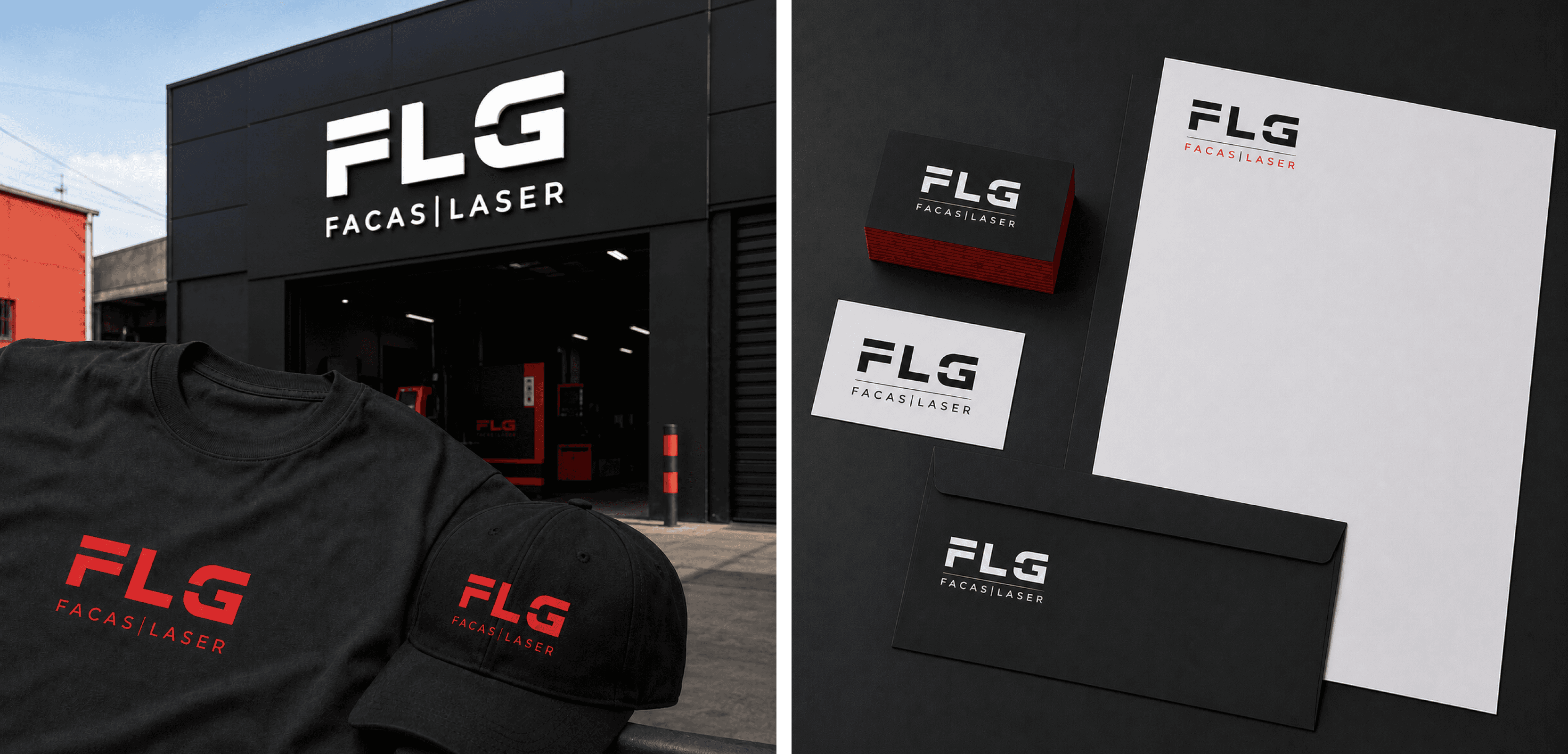
For an industrial brand, restraint is the argument, a system that holds its own rules demonstrates the discipline the product is sold on. We worked from application backwards: what the vendor has to reproduce set the constraints for the mark, not the other way round. AI assists the mechanical early passes; the judgement calls and the final craft stay human.

Two colors and no gradients.
The obvious move for a laser-cutting company is metallic gradients and glow, it looks like the technology. We rejected it because gradients degrade badly across the surfaces this brand actually lives on: powder-coated steel, single-color vinyl, engraved plate.
Trade-off: less visual drama in the pitch deck, in exchange for a system that reproduces identically everywhere — itself an argument about precision.
An identity a vendor can't get wrong.
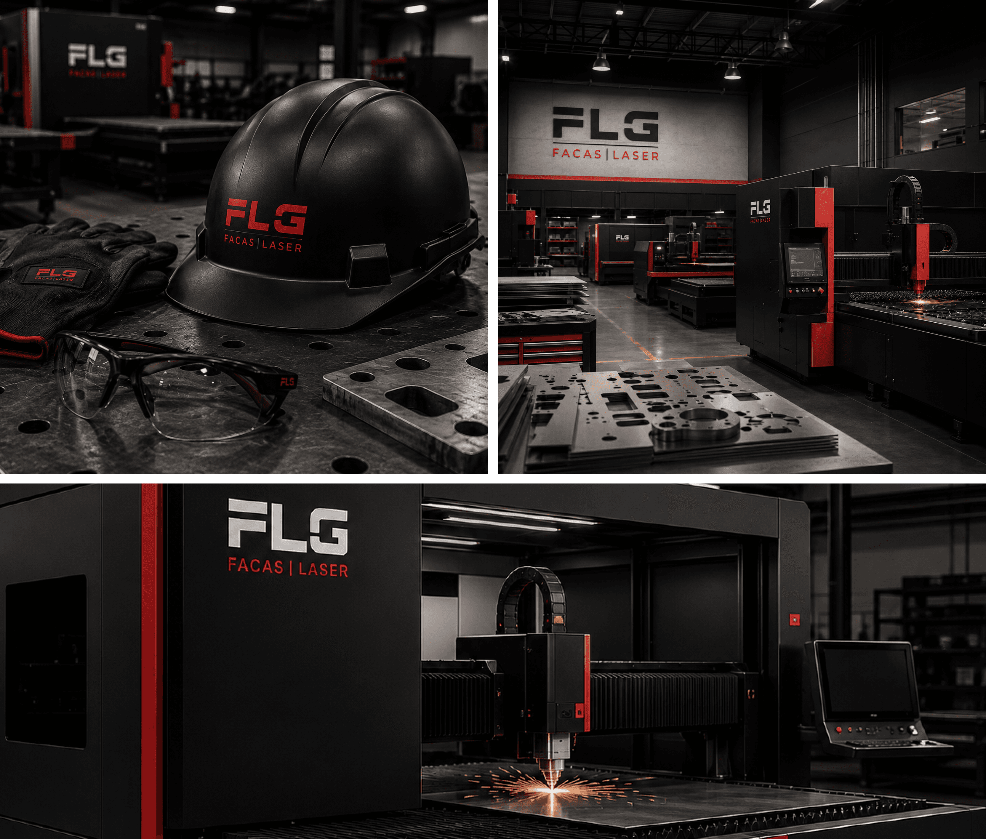
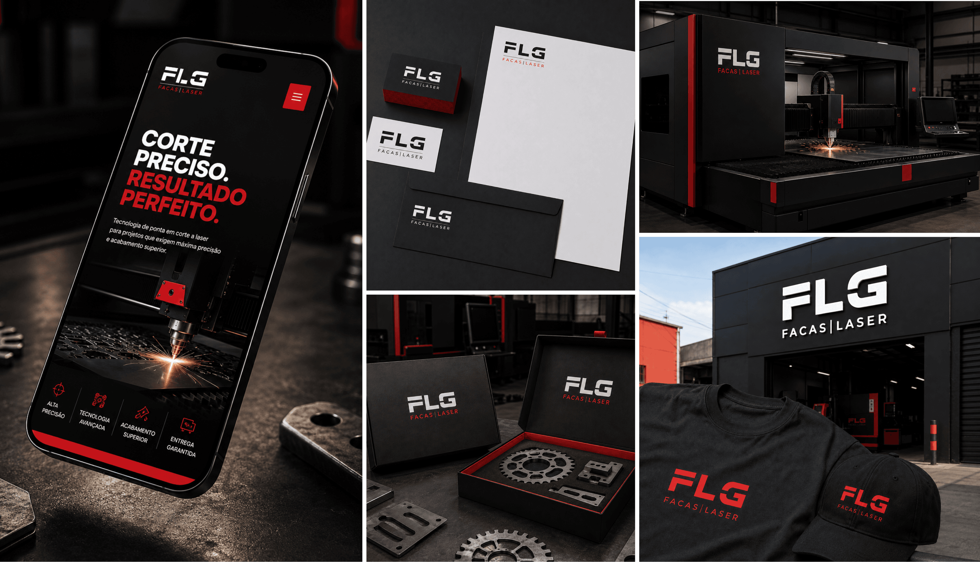
A three-tier logo system, a two-color palette, typographic rules, and an application suite across signage, print and vehicle.
All of it documented in a bilingual guide with explicit don'ts, designed to be executed correctly without a designer in the room.
A brand that matches the tolerance of the work.
Three-tier identity system: A complete system spanning machined plate to vehicle signage.
Vendor-ready guide: Bilingual, with explicit don'ts, so print vendors can execute unsupervised.
Business outcome pending: Awaiting confirmation from FLG on quote win-rate or perception shift.

Learnings & Next Steps
Industrial brands are judged on reproduction, not on the presentation deck — the system is only as good as its worst vendor execution. The open item is a confirmed business outcome: we are waiting on FLG for quote win-rate or a perception shift before this page claims one.
“I loved the process with Rasa & the frixB team. I wanted someone who found aesthetics as perfect. He was always attentive to me. He gives you full attention to your questions. I hope he has every success, my best regards.”
★★★★★
Does your brand undersell the quality of your work?
Work with Us
Book a Strategy Call